Pattyn
-
Year
2021
-
Client
Pattyn Energietechnieken
-
Type
branding, graphic design, strategy
Pattyn makes buildings smarter, greener and more efficient by implementing a range of energy installations. STUDIO KELF looked after their rebranding.
BRIEFING
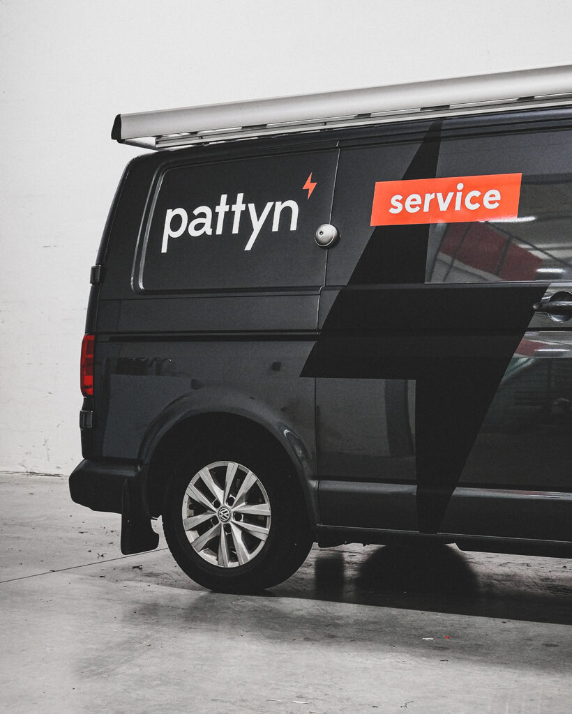
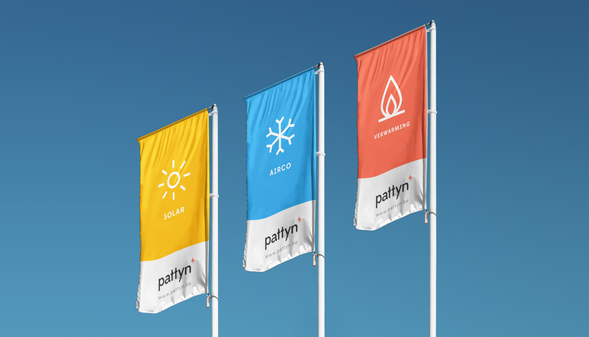
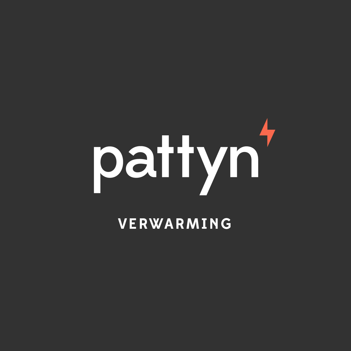
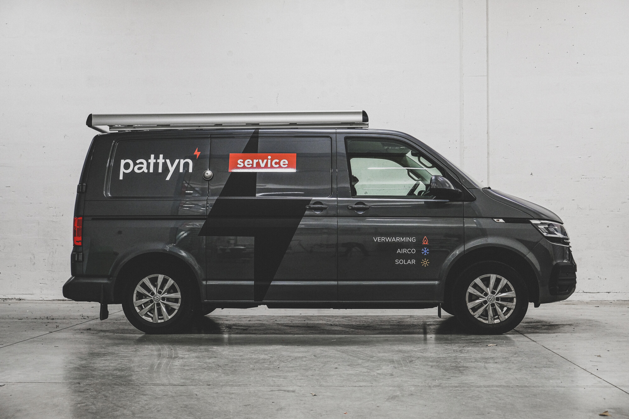
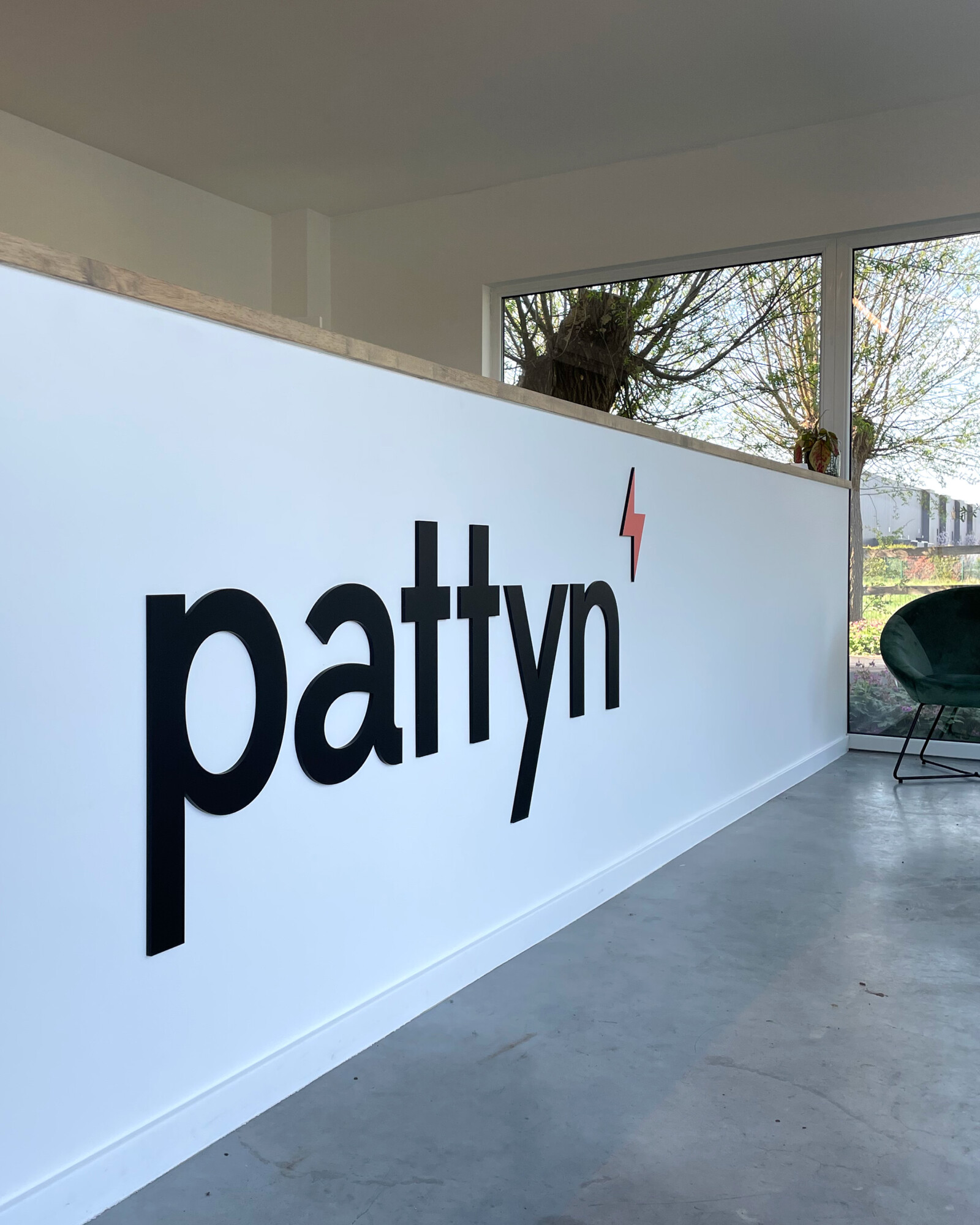
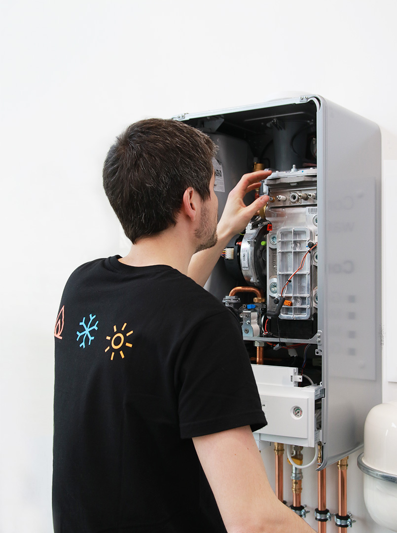
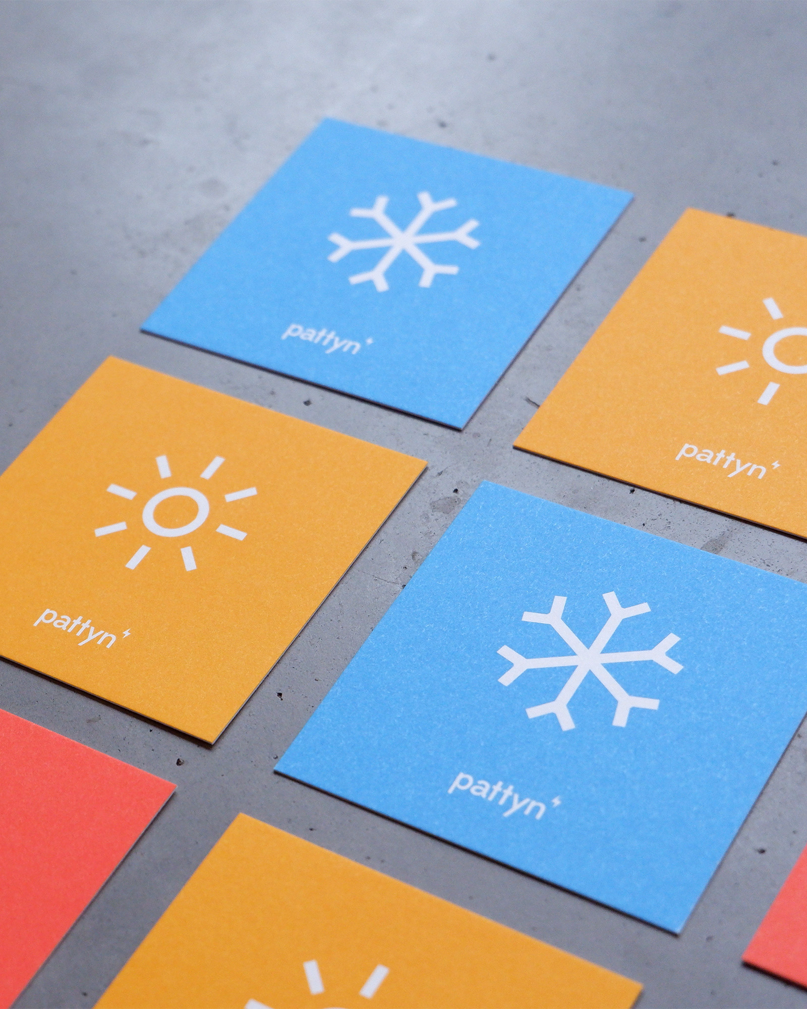
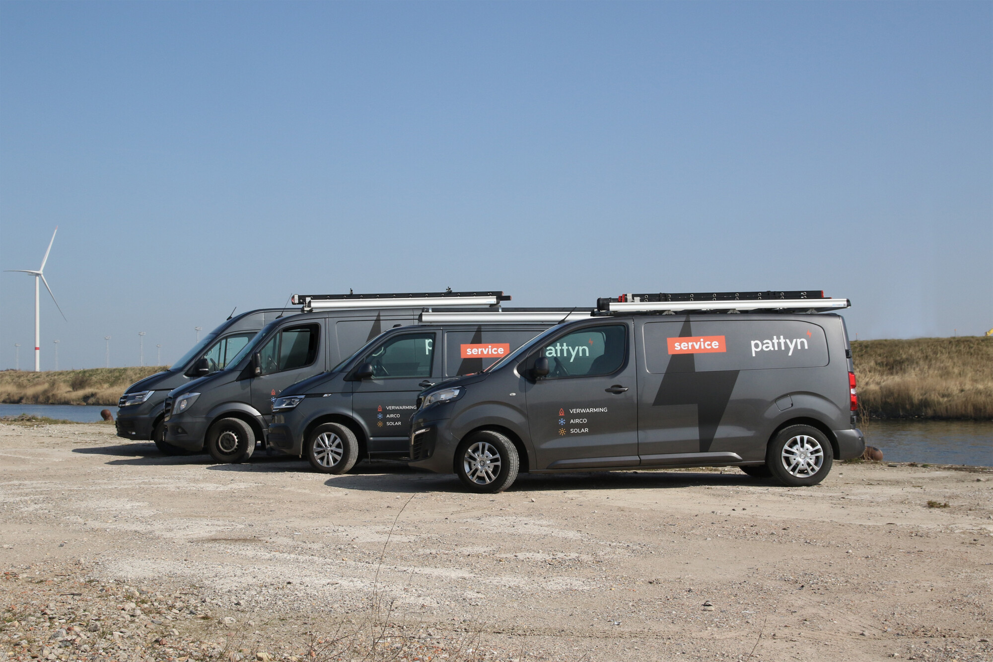
Next to heating, Pattyn wants to provide their customers with airco and solar energy as well. By communicating this purposefully to their target audience through a rebranding, they strive for growth and a larger market share. These energy specialists (hence the ⚡️ as an emblem) stand for quality and service. Ward and his team work correctly and efficiently and always try to be one step ahead of competitors.
APPROACH
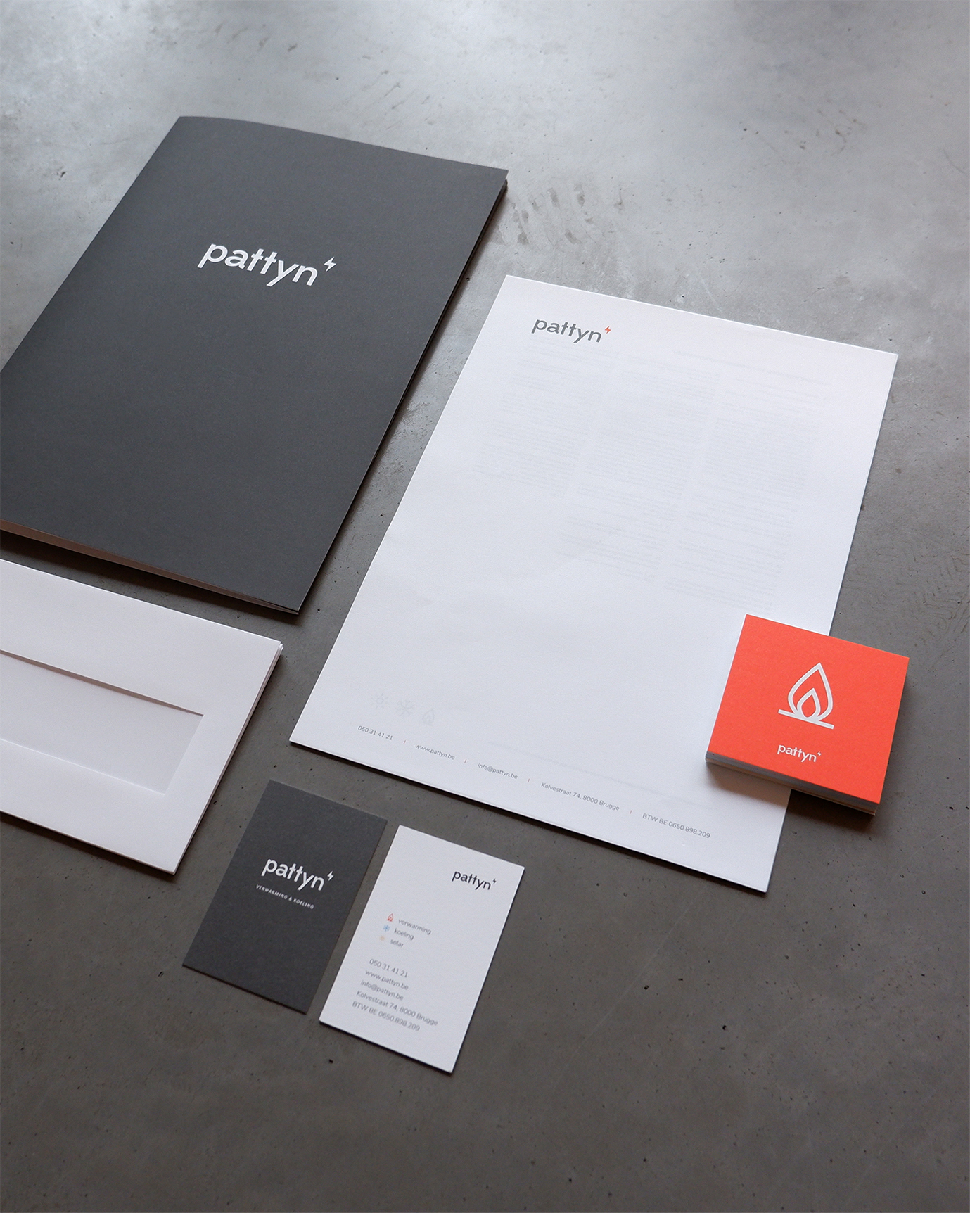
The brand was stripped down to the essentials and we thought about their positioning. With the use of icons we clarify what services the HVAC specialist offers. The new visual identity is an extension of their way of working: qualitative and accessible. We poured some color on top of the less is more identity to increase accessibility. A big plus is the increase of visibility on the streets. The carefully designed and developed website gives peers the needed information in the rapidly changing energy sector.
RESULT
Pattyn is growing at a fast pace. The business swapped their base camp for a bigger one and hired new technicians. The core of their business also shifted to bigger projects. Projects they love and offer more revenue.