Proximus
-
Year
2025
-
Client
Proximus
-
Type
branding, identity
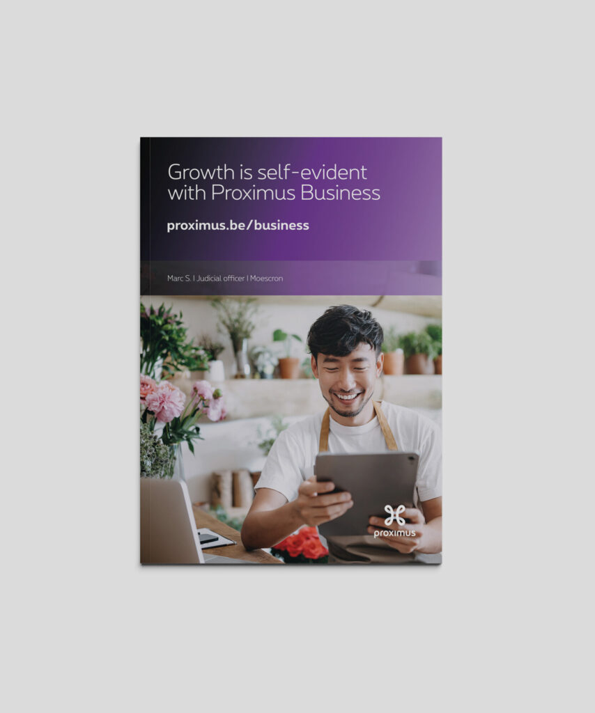
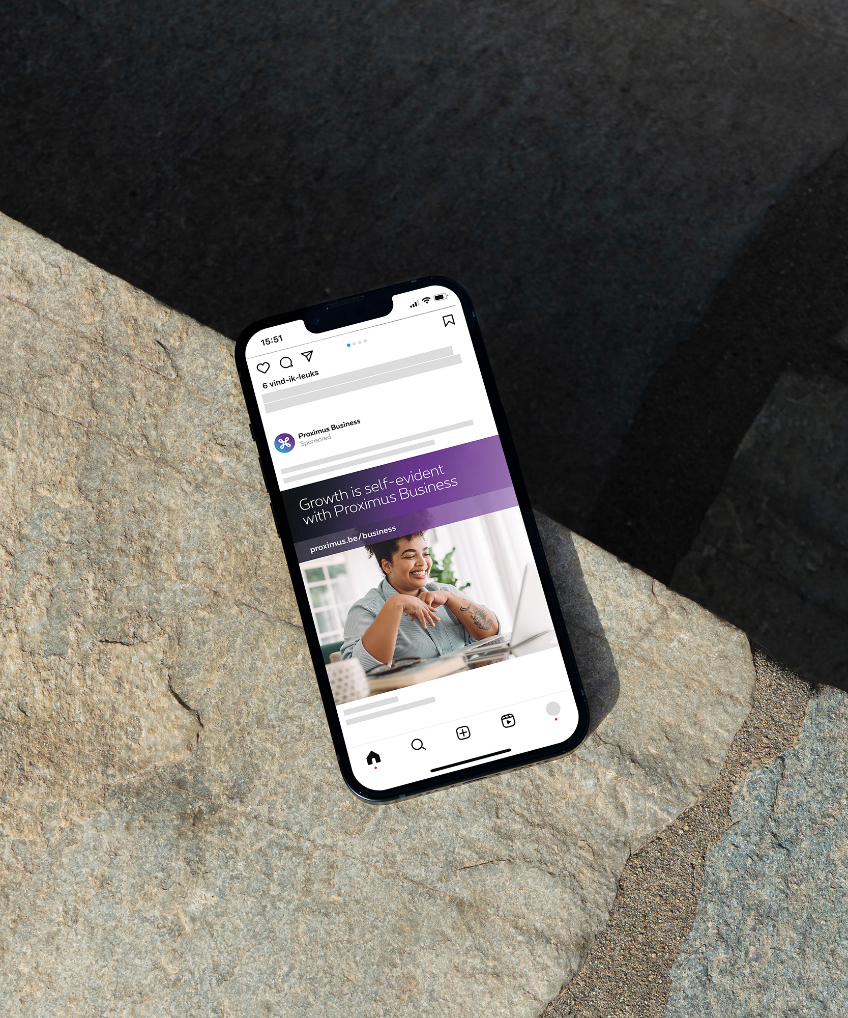
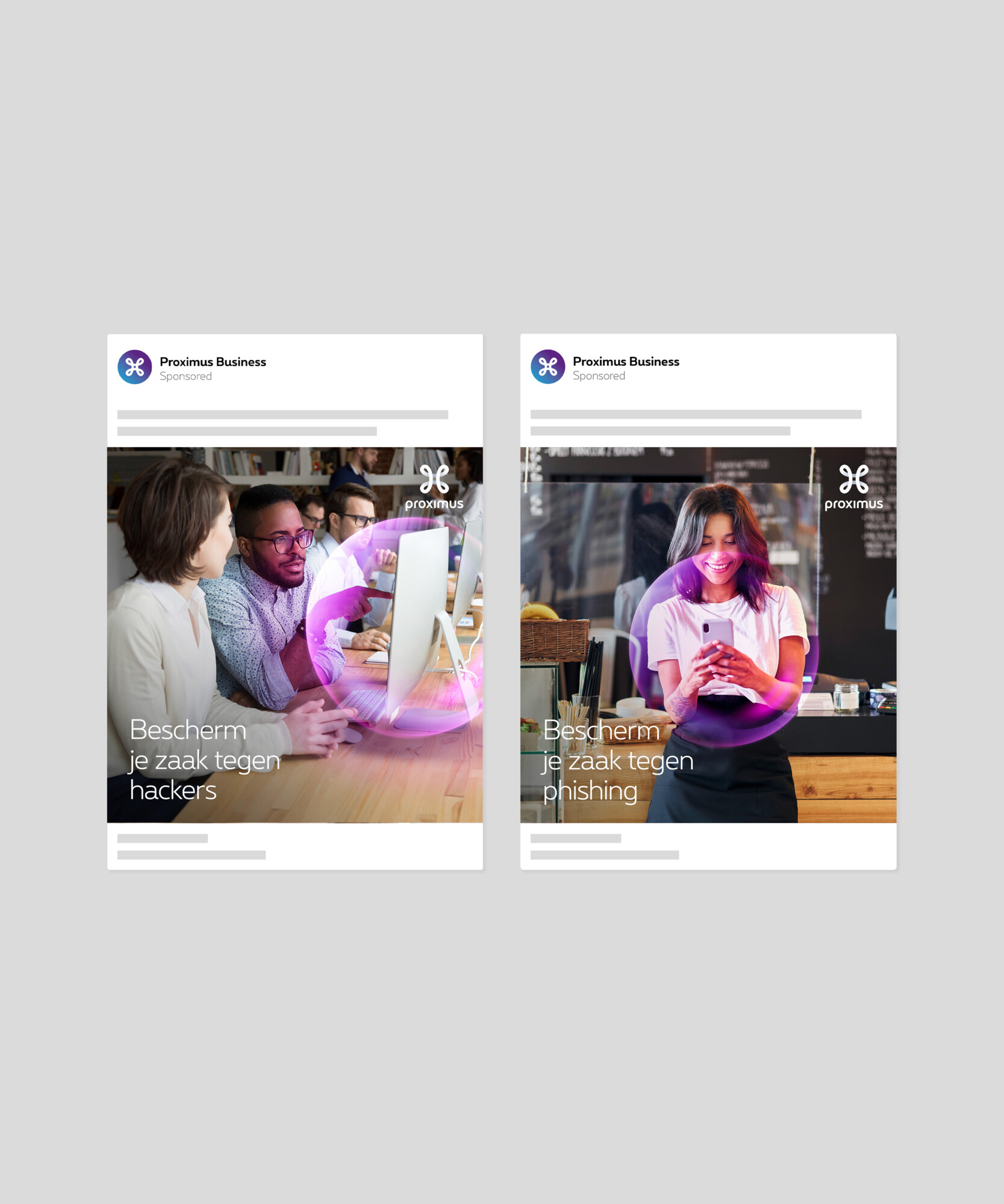
STUDIO KELF had the opportunity to redesign the visual identity for the SME segment of Belgium’s leading telecom provider, Proximus. SME is a sub-brand within their broader Business offering.
BRIEF
The new identity needed a distinctive look and feel—something that clearly says “business” while staying visually connected to the main commercial brand.
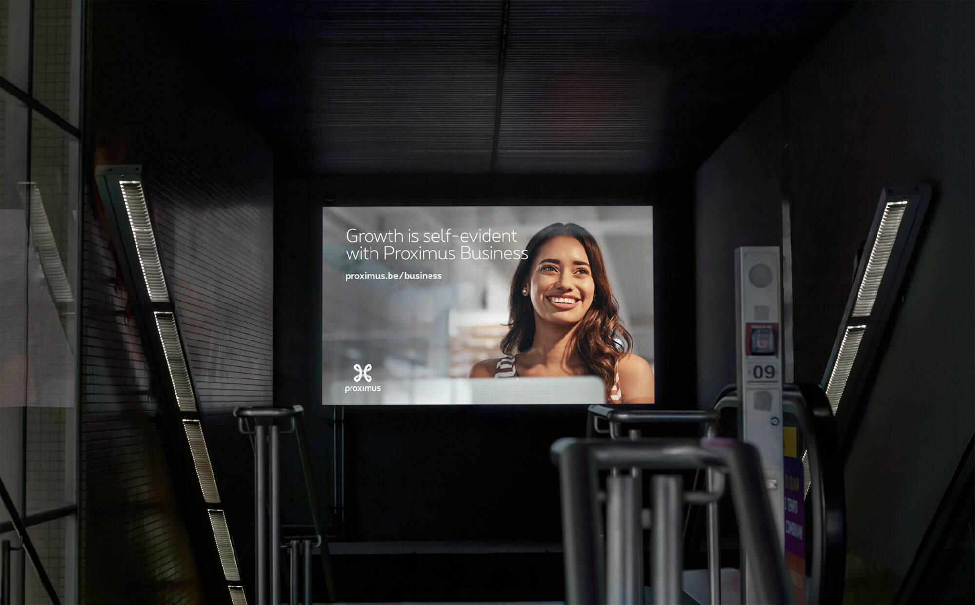

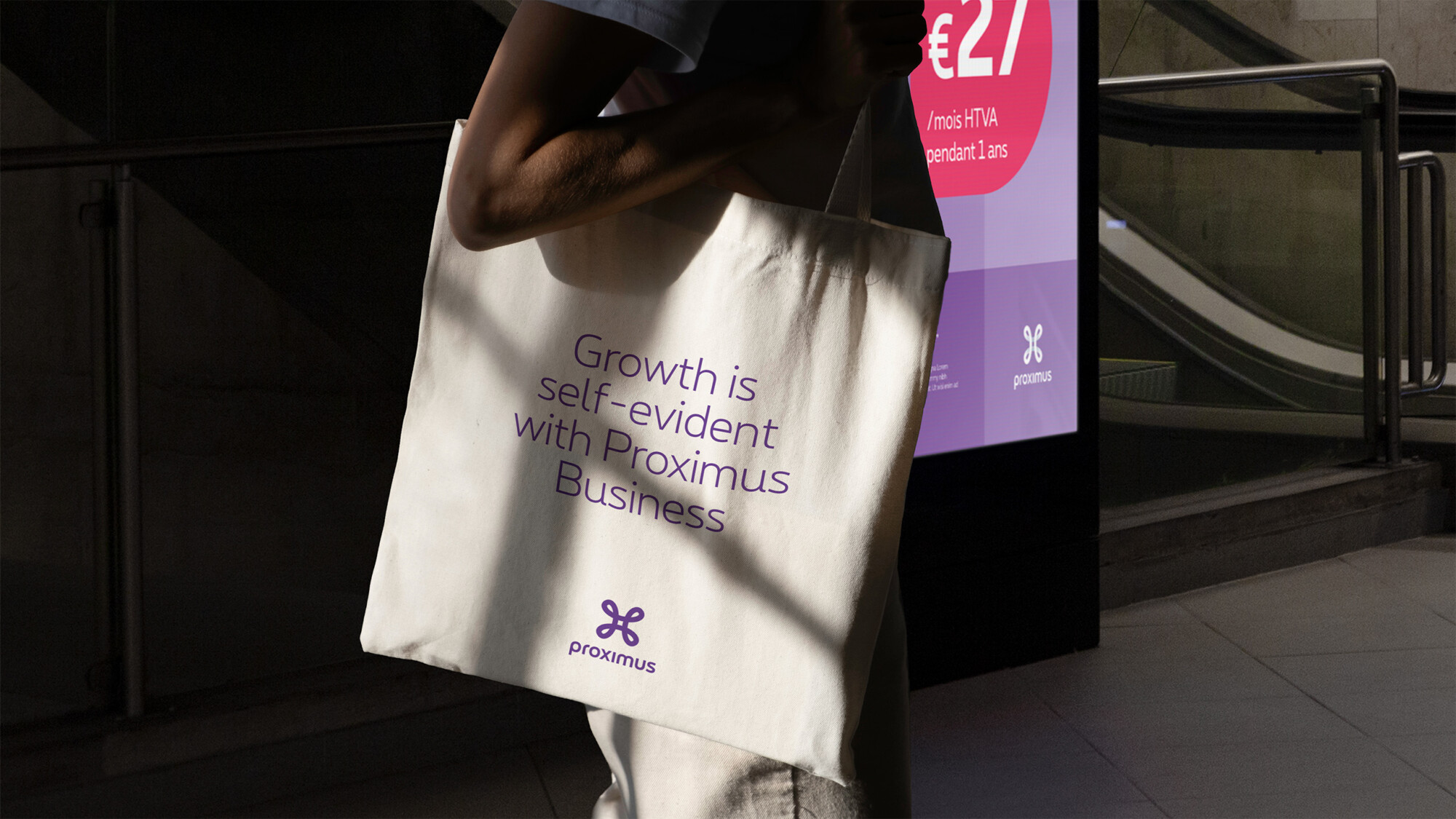
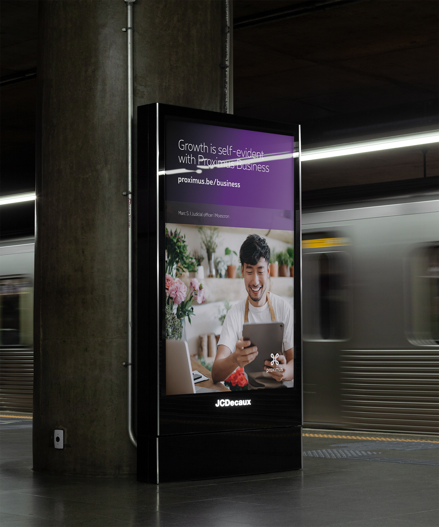
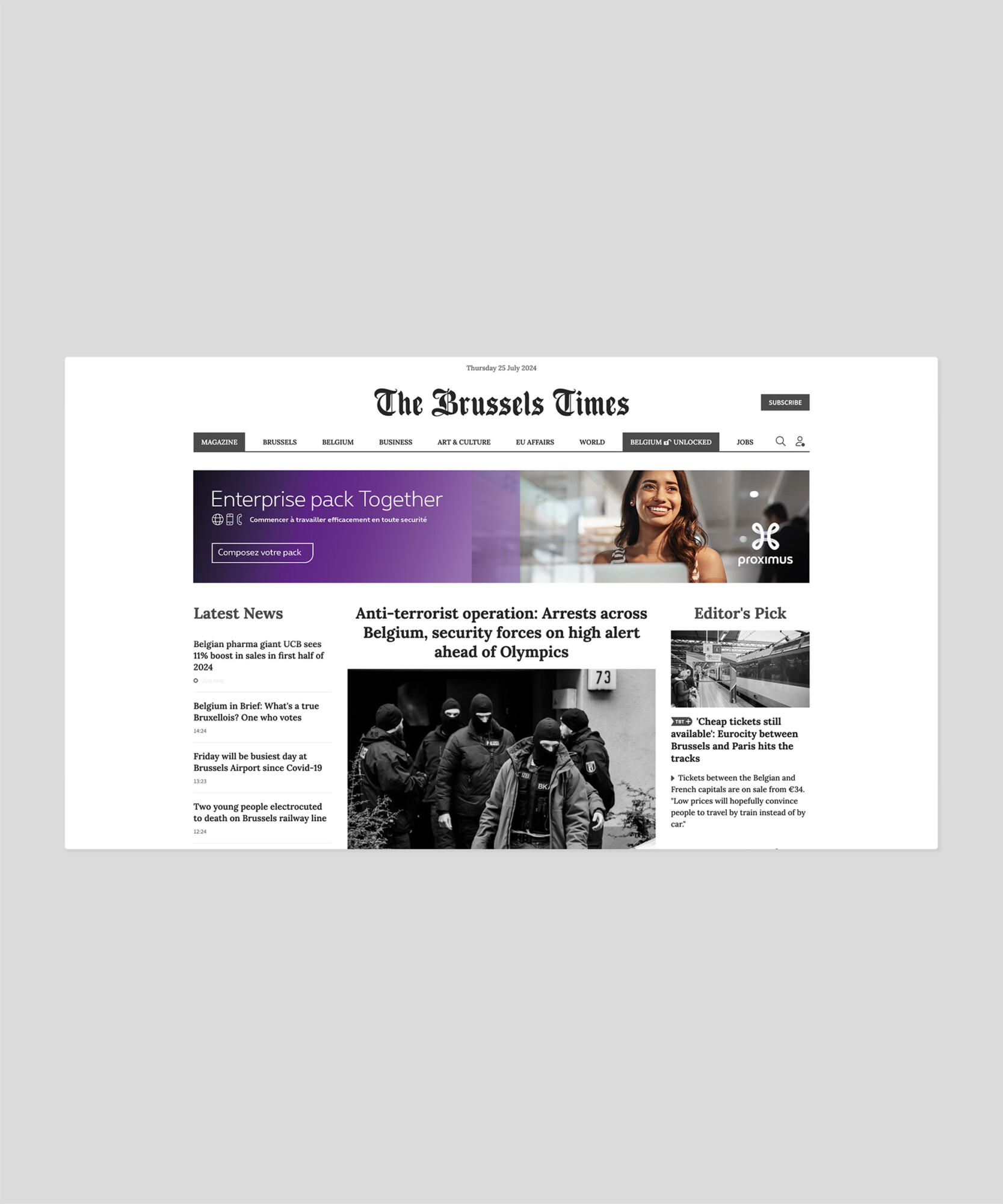
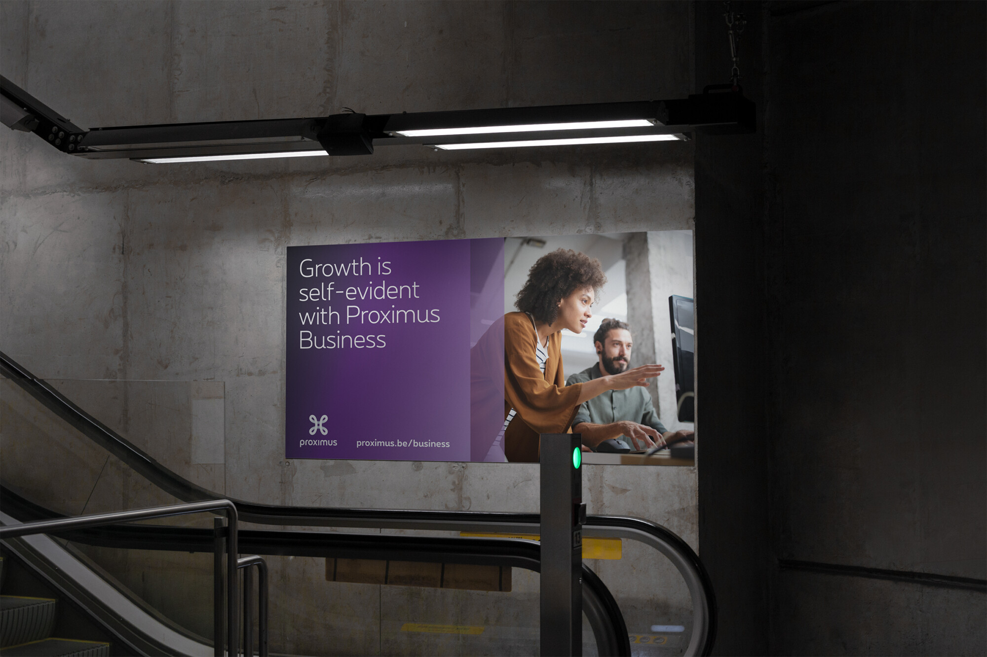
APPROACH
We replaced vibrant colors with more subdued tones to put the spotlight on the photography of real business owners. Bold font weights were switched to lighter ones, giving the overall look a more refined, professional edge. Finally, the iconic purple bars were used as both content containers and visual anchors—helping entrepreneurs instantly grasp the message, because we know their time is valuable.